
Tea Company Branding
Branding project for an organic tea company including a creative logo, advertisements, product packaging design and more.
The brand’s colors feature a harmonious blend of brown and green tones. The warm brown hues evoke a sense of nature and earthiness, reflecting the brand's commitment to naturalness and safety. Meanwhile, the green shades evoke the freshness of leaves, instilling feelings of tranquility, healing, and well-being.

COLORS

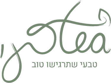
The logo is presented in a custom handwritten style that exudes a calming and fluid atmosphere, reflecting the brand's values. The logo elegantly merges the two words in a seamless design. These words are interconnected, with the letter "t" cleverly integrated to also represent the letter "ט" in the Hebrew word for "natural." Additionally, an icon of a leaf has been included, capturing the essence of the business.


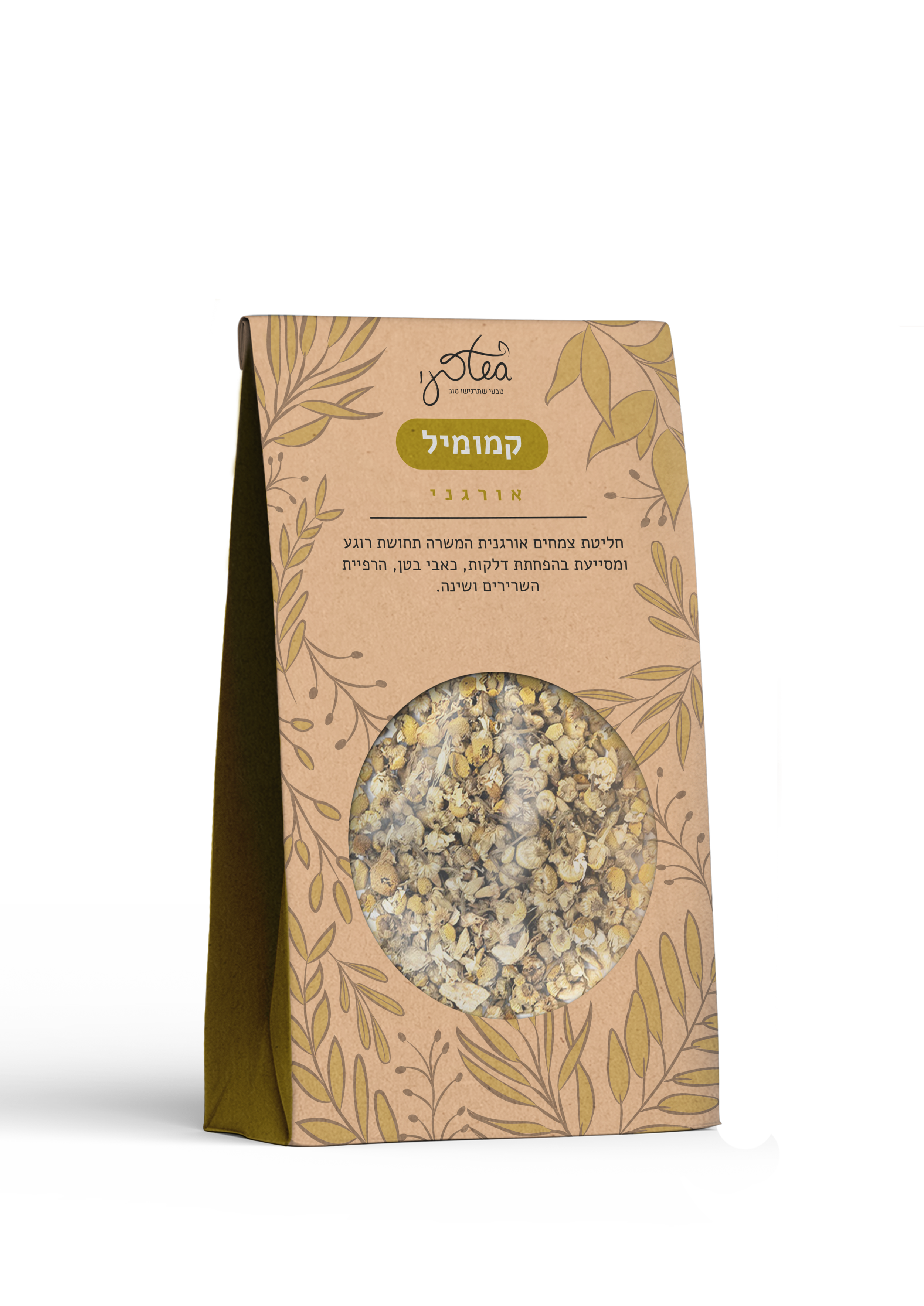
The tea packages are crafted in a style that reflects the brand's core values. The design features illustrations of plants to highlight the natural ingredients—pure herbal components. Each package is adorned with a distinct color that corresponds to the specific type of tea, along with a concise description of its unique benefits. In the packages, the tea variety is showcased through a transparent circle integrated into the design.


PACKAGES


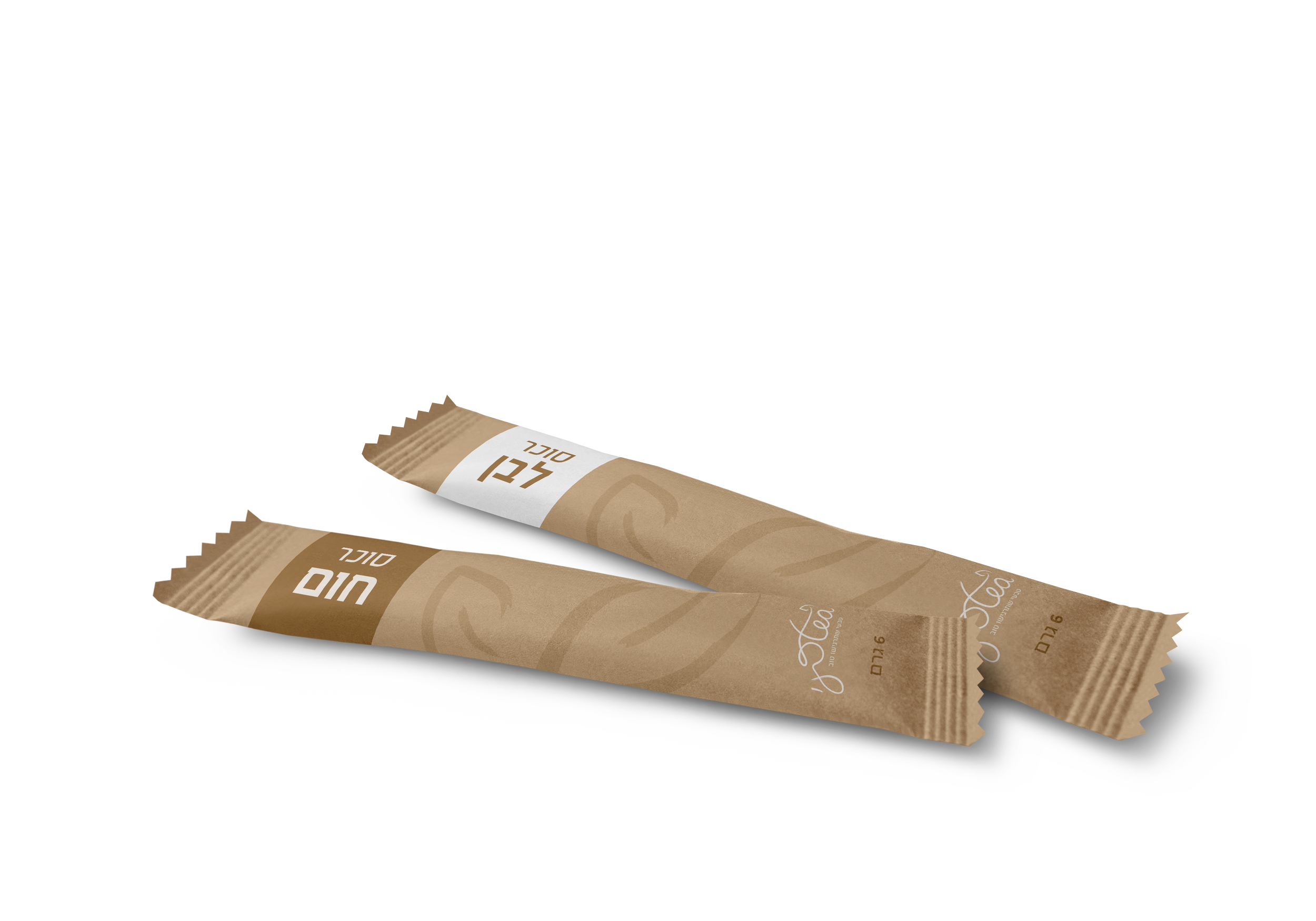
In line with the brand’s values, all packaging elements were crafted from paper to evoke a natural, organic feel. The designs include a branded paper bag, brown and white sugar sachets for sweetening tea, and a paper tea cup (including a paper lid, which is typically made of plastic).
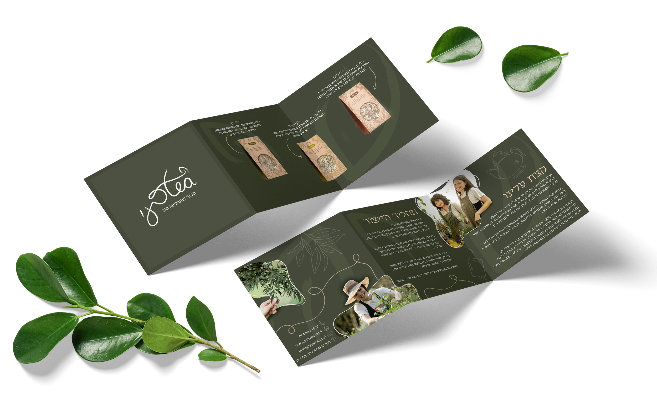

The brochure is designed in a dark style, showcasing the brand colors. It features the brand's products alongside atmospheric images that capture the essence of the business, along with custom illustrations created for the brochure.


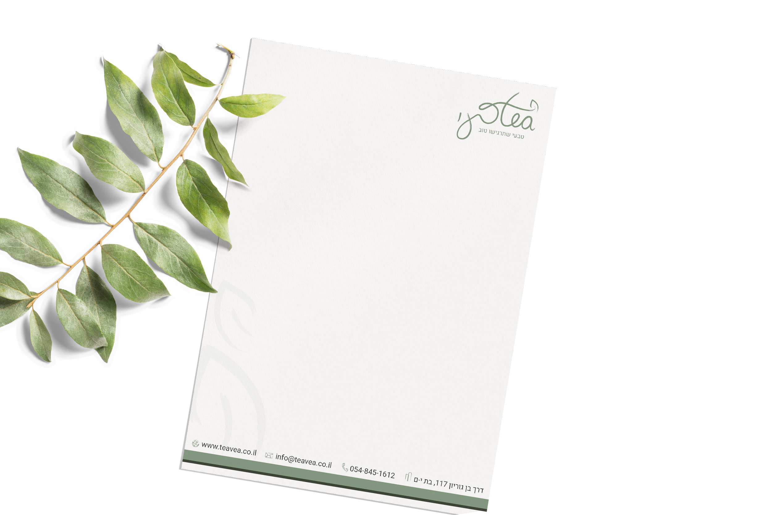
The documents are designed in the green shades of the brand’s colors. The business cards showcase custom continuous line icons that evoke a flowing, organic, and natural feel.
ADVERTISEMENTS


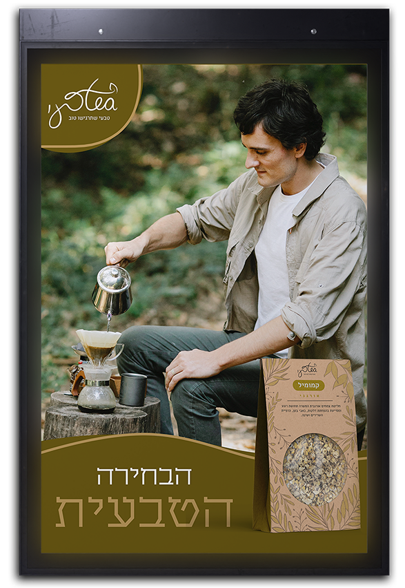

The advertisements were designed to reflect the colors and packaging of the products. The goal is to inspire the target audience to purchase the company’s products, which is why a tailored slogan was created for the campaign: "The Natural Choice." This slogan is prominently displayed in the ad to capture the viewer's attention. Each ad is assigned a distinct color that matches the product packaging featured, and mood-setting images of the target audience are incorporated to convey the desired emotions and brand’s message.